BRANDING
2014 - During my time at Mosak Advertising and Insights, I received the opportunity to work on a couple of branding projects. I find branding to be one of the most rewarding areas of graphic design. Seeing a client choose something you have put your heart and soul in to, and for it to represent their business or organization is a huge motivator for me. Branding and logos is essentially why I got in to this business in the first place. I can't get enough of it.
Edit from 2024 Brad- I wrote the above almost 10 years ago. I appreciate my attitude and I stand by almost every word I said. Since this design, I’ve learned many many many lessons. I used to design for myself and what I like. It didn’t take long to understand that the world of graphic design is definitely not about your own interests. Graphic design, in many cases, is turning complicated information into easily digestible bullet points for the masses while maintaining visual appeal. I’m choosing to leave my lessons in my portfolio. I think it’s extremely important for every graphic designer to remember that you’re not creating fine art, you’re creating visual messaging to convey a point as precisely as possible.
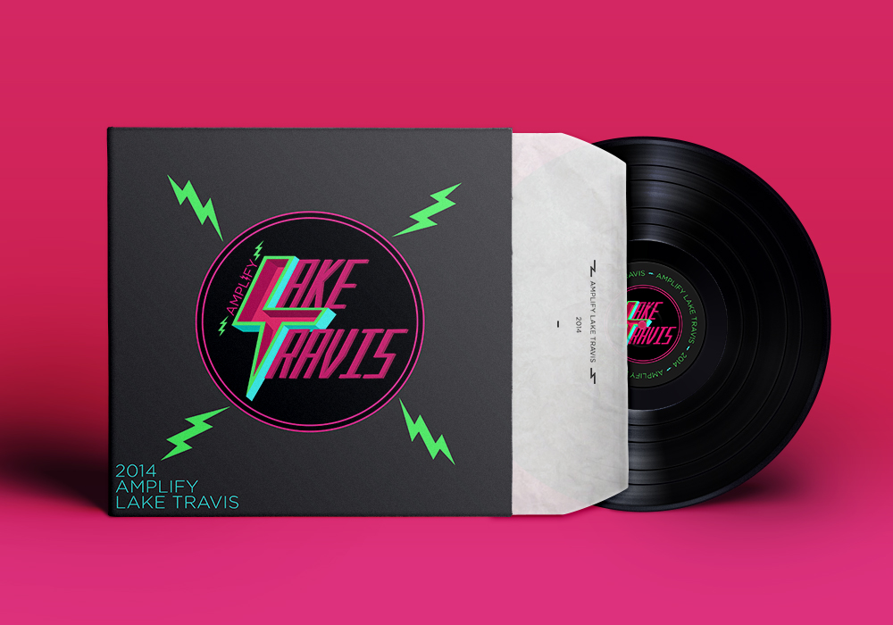
AMPLIFY LAKE TRAVIS
2014 - The Lake Travis community was looking for a logo that they could use for an event they were having. They wanted something a little outside the norm, they also wanted it to stand out. This was the design I finally settled on. The logo itself, to me, is just cool to look at. Honestly, if I have gotten to the point where I like to look at a logo then that's where I usually stop.
Edit from 2024 Brad - Another great lesson here. My mentors, David Ey, Ivhan Escudero, and Adam Rosenlund made more than a few points on this front. Just because I think it’s “cool” does not mean it’s an effective strategy or strong graphic design decision. I’ve learned to take many factors into my designs. Use case, materials, demographics, messaging, location, intention…it’s literally a science. Honestly it’s a little embarrassing that I used to think that “I think it’s cool” was an effective graphic design strategy. Live and learn.
INDUSTRY BREWERY
2014 - This was my submission for a brewery that was starting up out in West Texas. We were allowed to take some creative liberties with the branding look for this company. I decided to attempt a modern but industrial look. I like the way this logo turned out and the following mockups show how much this logo can grab the attention of a potential buyer.
Again, 2024 Update. Not a terrible design but definitely needed some workshopping. I had delusions back then that I was the best designer around. Small town attitude I think, like being the best football player in a town of 38. This logo had potential but looking at it now I can see a number of issues, including weighting of strokes, and a general imbalance. I think for one of my first label/logo designs 10 years ago, this is one of the strongest. I had a bad habit of going with my first iteration back then and didn’t even work on other ideas.
ONE TWO EAST
2014 - We were pitched an upscale luxury apartment complex meant to be built on the east side of Austin They requested that the designs be as simple and clean as possible. I landed on this logo after quite a few sketches and doodles. It is simple and can stand alone without the words "ONE TWO EAST".
2024 update: I don’t hate this one at all. The weight is off with the triangle being too big, and I don’t love the size and distribution of the dots, but this had some serious potential. I truly stand by this one. The building never came to fruition so we will never know what the logo would’ve been, but I think with a name like 1 2 East, I kinda nailed it. I don’t think I need to explain it but I will anyways. 1 dot, 2 dots, arrow pointing east and bobs your uncle. I’d actually like to take another stab at this one because when it comes to simplicity and recognition, this was probably my strongest concept from my early days of design. To this day I’m on the lookout for a project to make a real mark on this city. I feel like this could’ve been it.


